
DD06 • Inside OpenAI’s Usage Cliff
The viral chart nearly everyone read wrong.

// 3-4 min read · A single chart convinced the internet that students run AI. One deeper look that rewrites the story.
On another note: we just wrapped our very first Deeptech Decoded LIVE with Starcloud’s Philip Johnston. Looks like this was the kind of room deep tech–AI builders have been craving. Recap and highlights coming soon.
And since we’re on the topic of AI usage, I'm curious about the real picture here.
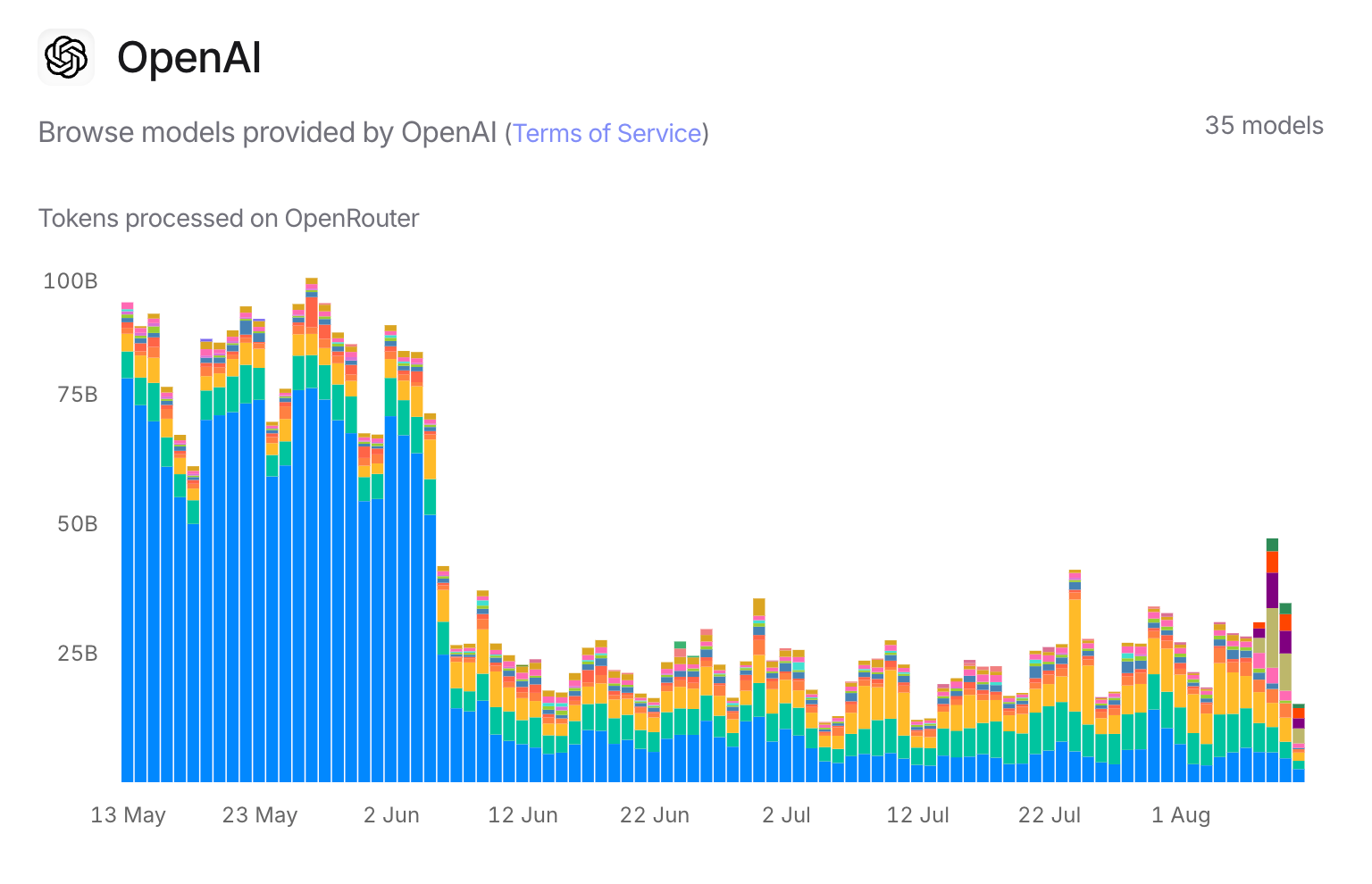
Last week, a chart of OpenAI usage went viral.
Here is the story that circulated online: Summer break hits, students log off, AI usage collapses. It sounded neat, felt intuitive and spread like wildfire. A single chart convinced thousands of smart people that students drive the AI market.
The problem: it’s a cropped view of the market. When you zoom out, the pattern breaks and the real explanation tells a very different story about how AI adoption actually works.
A picture might be worth a thousand words, but only if you understand what you're looking at. We love to treat charts as the language of reason, yet the moment we see a line, bar or percentage paired with a conclusion, we stop asking questions. The numbers feel final. The conclusion certain.
Why do we love oversimplifying stories? Our brain neurons love shortcuts and rush toward that short-term, feel-good illusion of "understood" and "done." But that comfort comes at a cost: it blinds us to nuance and makes us easy prey for misleading patterns. And when even smart people fall for those patterns in fundamental market data, the result can shape decisions worth billions.
As we increasingly co-exist with ever-smarter AI, we need to get better at steering the reasoning and doing it more effectively with machines on our side.
The Essentials Up Front:
One viral chart of token usage from a narrow dataset convinced thousands that students drive AI. It was a narrow window into a vast ecosystem. The real story runs deeper and it demands nuance, context, more than oversimplified headlines.
Partial view → A slice of the market, not the whole pie. The dataset doesn't represent the entire universe in question.
Scope matters → Mostly dev apps, research teams and playground users. No full view of OpenAI's entire ecosystem.
Summer slowdown? Yes, but pricing changes, API throttling, and model shifts also drive major moves.
Cross-provider reality → Some vendors dipped in June, others climbed. No universal pattern.
Scale perspective → Your daily usage is microscopic. A few big API customers moving workloads can redraw the entire chart.
Without context, a chart is an inkblot. The real story lies in who's represented, who's missing, and why the lines move.
“It's not things themselves that disturb us but our opinions about them.”
— Epictetus
00/ Data to Help Decision Making
A chart is just marks on a graph until we load it with meaning. Too often, the meaning we load says more about our bias and tendencies than the truth. The skill isn’t reacting to the line’s rise or fall, but reasoning through why it moves, what’s missing and whether we’re even looking at the right picture.
As for its importance, it is utmost. Because it shapes our judgment and influences our strategy.
01/ When Charts Go Viral, Reason Goes Missing
If your LinkedIn feed looks anything like mine, you’ve probably seen that chart making the rounds always with the same copy-paste take:
“School holidays kicked in. Students logged out. AI power users are students.”
It’s exactly this kind of snap judgement that made me write this piece on a whim.
Watching smart, tech-savvy people jump to irrelevant conclusions from incomplete data was genuinely disappointing. First of all, a chart without context is an inkblot; what you see reveals more about your assumptions than the underlying reality.
Secondly, correlation isn’t causation. Yet, too often, viral charts become Rorschach tests where we project our biases onto incomplete patterns.

The "student theory" spread because it felt intuitive. School ends, usage drops and the case is closed. But intuitive isn't the same as correct.
So let’s do what most haven’t: slow down, look wider, and reason it right.
02/ The Chart Everyone’s Talking About
The chart comes from OpenRouter’s OpenAI usage data which is just one slice of the ecosystem. If you’re not closely following this space, here’s what you’re actually looking at.
It includes:
✓ a mix of developer apps
✓ research projects
✓ a handful of consumer playground users.
It excludes:
✗ enterprise accounts
✗ direct API customers
✗ the millions using ChatGPT Plus outside of OpenRouter.
There's also no breakdown between academic, business or casual use. No distinction between human chats and automated high-volume jobs, either. Without that granularity, you're comparing apples to... well, any other fruit you want.
Case in point: Khan Academy's AI usage didn't show the same dramatic June cliff. Different audience, different behavior patterns.
So when someone looks at this chart and declares they've uncovered the truth about OpenAI's global usage? They're solving a jigsaw puzzle with half the pieces missing and drawing in the rest with a crayon.
And yes, there’s a very clear cliff in early June. The “summer break” theory says this is when students logged off, taking AI usage with them.
But before we buy into that narrative, let’s check if the same pattern shows up across other providers.
03/ The Cross-Provider Reality Check
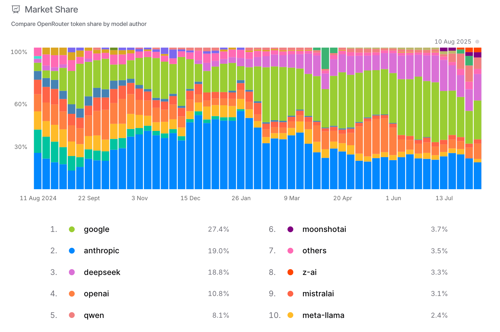
One of the most effective ways to validate a theory is to verify that it consistently holds true across different data sets or scenarios.
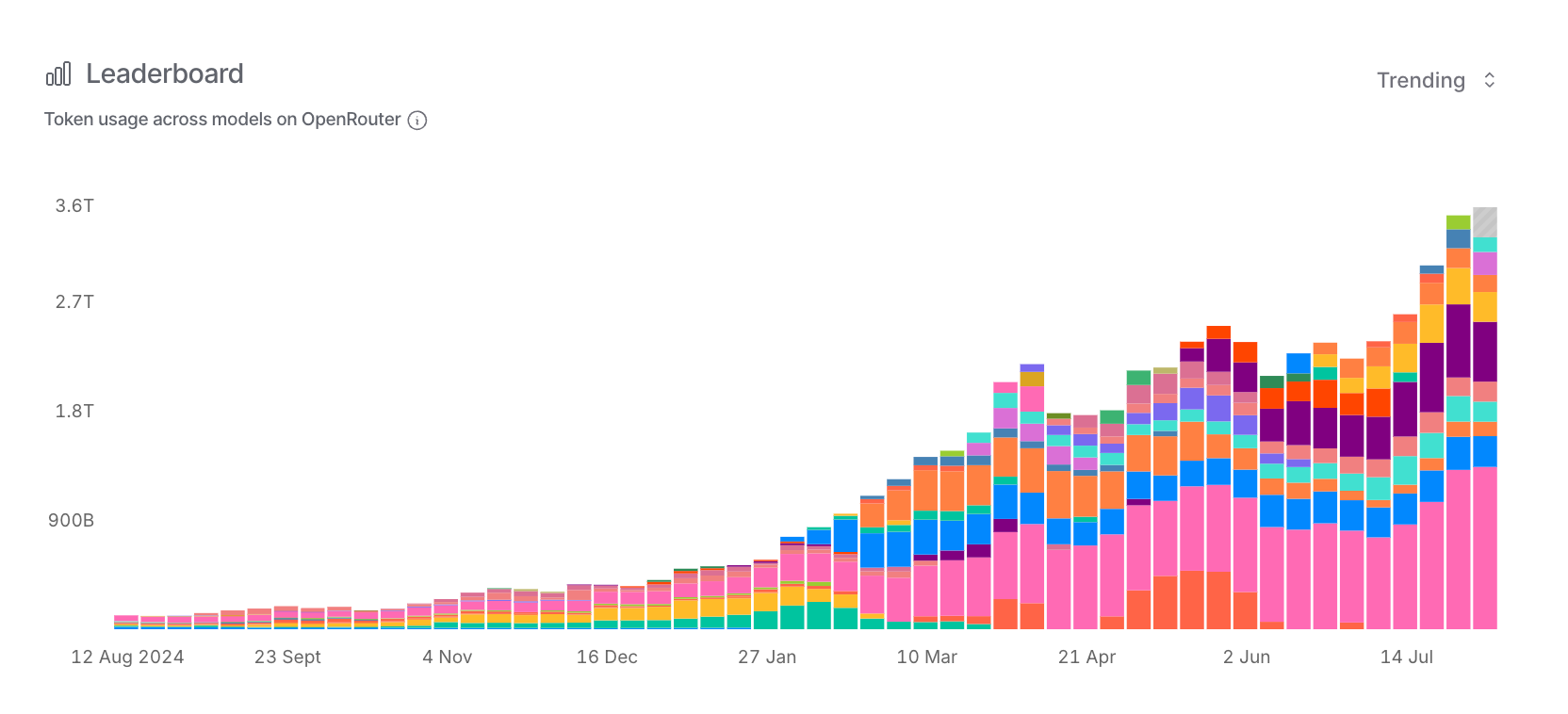
Thanks to OpenRouter’s Leaderboard, we can do exactly that. Not just for OpenAI, but for Anthropic, Google, DeepSeek and others.
But first, here's the context nobody mentions: OpenAI represents just 10.8% of OpenRouter's token share as of today. The chart that "shook the internet" reflects roughly one-tenth of even this limited dataset. We're drawing massive conclusions about "AI adoption" from this.
This is like watching one food truck in a single city and declaring insights about McDonald's global performance.
When we zoom in on the same critical dates (May 26 → June 9), we can see the finer details that crumbles the "student exodus" theory.
From May 26 → June 9:
OpenAI GPT-4o-mini: 473B → 61.5B | ≈ 86.99% decline
Anthropic Claude Sonnet 4: 271B → 270B | ≈ 0.37% decline
DeepSeek V3 0324 (free): 107B → 122B | ≈ 14.02% rise
Google Gemini 2.0 Flash: 220B → 266B | ≈ 20.91% rise
If students drove the market, every provider should have crashed simultaneously. Instead, we see a mixed pattern that screams "product-specific factors," not "universal demographic shift."
DeepSeek and Google actually gained usage while OpenAI dropped. That's not students going on vacation. That's market dynamics at work.
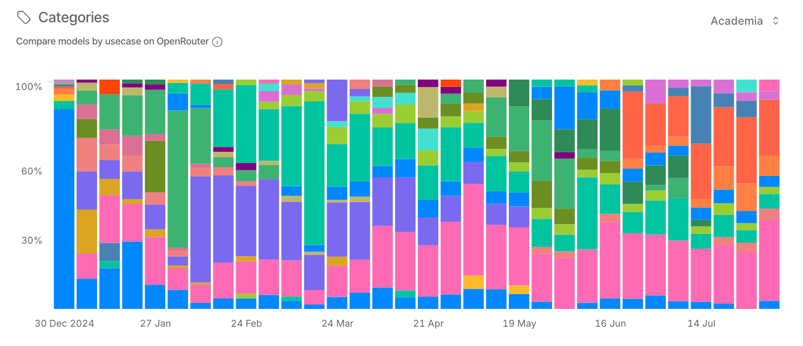
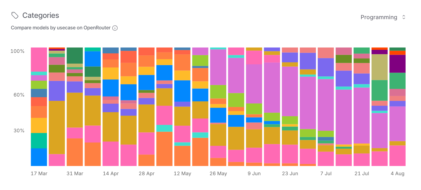
Looking at OpenRouter's usage by category over time, you can see how OpenAI dominated through early 2025, then sharply declined in June, while other providers filled the gap.
The category breakdown tells an even clearer story: Programming usage shifted massively while “Academia” stayed flat, pointing to developer workflow changes, not general student behavior.
In AI adoption, as in everything else, context is king.
This cross-view is the goldmine. It moves us from single-line storytelling to a market-level lens. Instead of “students logged off, end of story.” We start asking better questions like
Which users does each platform attract?
How are they integrating AI into their work?
What external triggers truly shift their behavior?
Is there any real alignment between the market-level view and the OpenAI-only narrative?
The same calendar date can mean “summer slump” for one platform and “new-release surge” for another.
04/ Causation vs. Correlation
A sharp drop in early June is hard to miss. The summer school break explanation is tempting: schools are on summer break, students log off, usage falls. It's neat, it's simple yet it isn't the whole story.
Pricing changes, model updates, API throttling or the retirement of high-usage models can move the needle just as dramatically. Sometimes one or two large API customers shifting workloads is enough to create a cliff. We're dealing with multi-factor reality, not single-cause narratives.
Historical data does give the summer theory some weight. Bloomberg reported that in 2023:
Daily token usage peaked at 97.4B during finals season (May 27)
Daily token usage dropped to 36.7B/day in June once schools are on summer break.
That’s a 54% decline.
Usage also dipped on weekends during the school year, mirroring student engagement cycles.
But summer break affects more than students, the entire workforce slows down. It's one piece of the puzzle, not the complete picture. Treating it as the explanation is like blaming weather for every delayed flight. Sometimes it's the storm, sometimes it's the airline and sometimes it's the airport.
05/ Scale Perspective: Why You're a Hairline in the Chart
Let's put your own usage into perspective.
Say you're a heavy Plus user: GPT-4o mini running all day, proofreading texts, writing reports, generating images, crunching data. You might rack up 25,000 tokens a day. Sounds like a lot until you realize OpenRouter's daily totals run in the trillions.
That makes your share about (25K ÷ 70B) 0.000036% of the daily pie. A hairline in the graph, if they even bothered to draw you.
This isn't a playground dominated by individual enthusiasts. Most of that volume comes from automated, high-volume workloads: dev apps firing thousands of requests a minute, research pipelines chewing through datasets, enterprise integrations running around the clock.
That's why a sudden "cliff" in the chart could just be a few API customers shifting workloads, pausing projects or moving to another provider.
It's not a million people waking up one morning and quitting AI cold turkey.
A fun aside:
At that usage level, your API bill would be roughly $7.50/month versus $20 for Plus. Sure, API unit prices are lower, but Plus gives you the full product experience: web and app interface, ease of use, higher model priority and no need to watch your token count like a hawk.
Still, OpenAI tracks those tokens for a reason. They need to know:
How much compute the Plus user base consumes → capacity planning
How platform load is distributed → the charts you've seen
Where patterns emerge → spikes in long prompts or seasonal waves around school deadlines.
06/ The Stakes of Getting It Right
This isn't just about correcting a viral misinterpretation. When influential builders, investors and strategists collectively misread fundamental market data, they don’t only distort the narrative but also steer billion-dollar decisions off course.
The chart literacy rules that matter:
Know the source and its limitations
Ask who's represented, who's missing
Separate correlation from causation; visible events often mask underlying causes
Understand scale. Individual behavior rarely drives enterprise-level charts
The real story in these charts isn't "millions of students logging off." That narrative is seductive because it's simple. The truth has many more layers: enterprise workload shifts, API pricing changes, model updates, and large customers migrating between providers.
The "student theory" implies AI adoption is fragile and seasonal, driven by academic calendars. The reality suggests something far more valuable: a mature B2B market where usage patterns follow business cycles, not summer break.
People who read these signals correctly will time launches better, target the right segments and avoid optimizing for the wrong user base. Those chasing viral narratives will misunderstand their actual market dynamics.
The OpenAI chart went viral because we, humans, love simple explanations. They feel satisfying. But in a market moving this fast, reacting to data isn’t enough. We need to understand what it actually represents.
A drop in one API's usage isn't proof that students drive AI. It's one data point in an enterprise-dominated ecosystem. The opportunity isn’t in chasing seasonal dips; it’s in reading the deeper currents and building for where they’re flowing next.
Markets reward those who navigate by currents, not headlines. Read them right, and you’ll know when to double down, when to pivot and when to stay the course. You’ll spot the turn long before the rest of the field catches on.
Because the tide doesn’t wait for late sailors.
End of Line.
{ Next release loading... }
Stay essential,
Nihal